Meridian UI
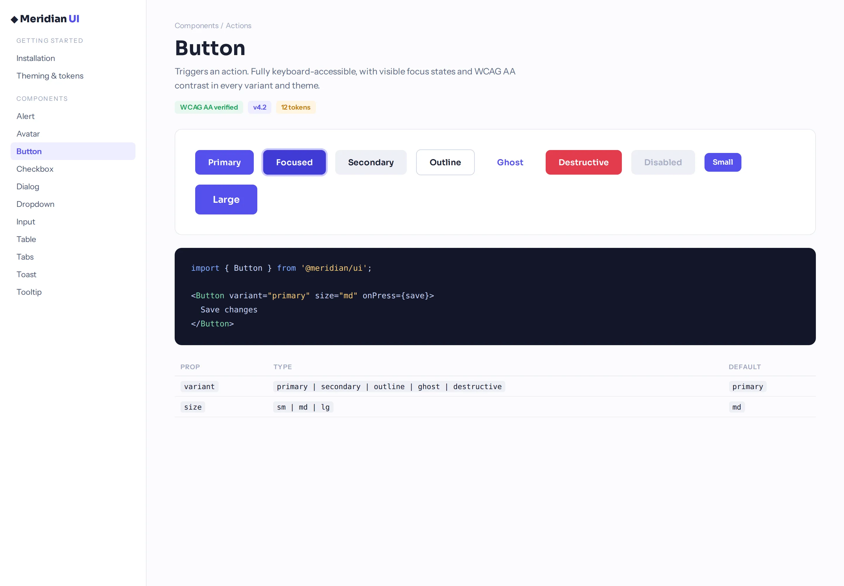
Design systemAn open component library — 60+ accessible components with tokens, docs, and do/don’t examples.
The idea
Design systems fail when nobody reads the docs. Meridian is an exercise in documentation people actually use: live examples, copy-paste snippets, and accessibility built in rather than bolted on.
The approach
Token-based theming, every component keyboard-tested and screen-reader-tested, Storybook docs with do/don’t pairs, and migration codemods as a first-class feature.
What it proves
60+
documented, accessible components
WCAG AA
every component, verified
Open
source — read every line